Photographing Your Artwork

Photographing Your Artwork

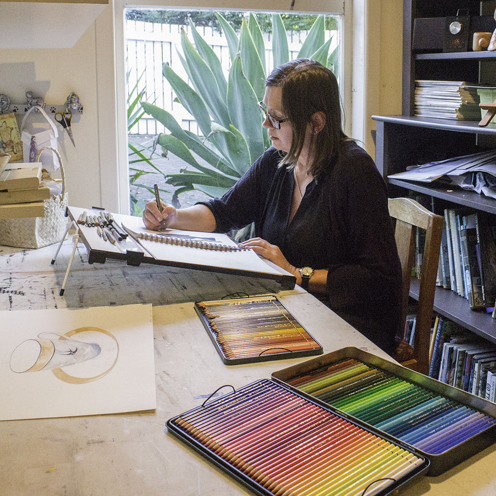
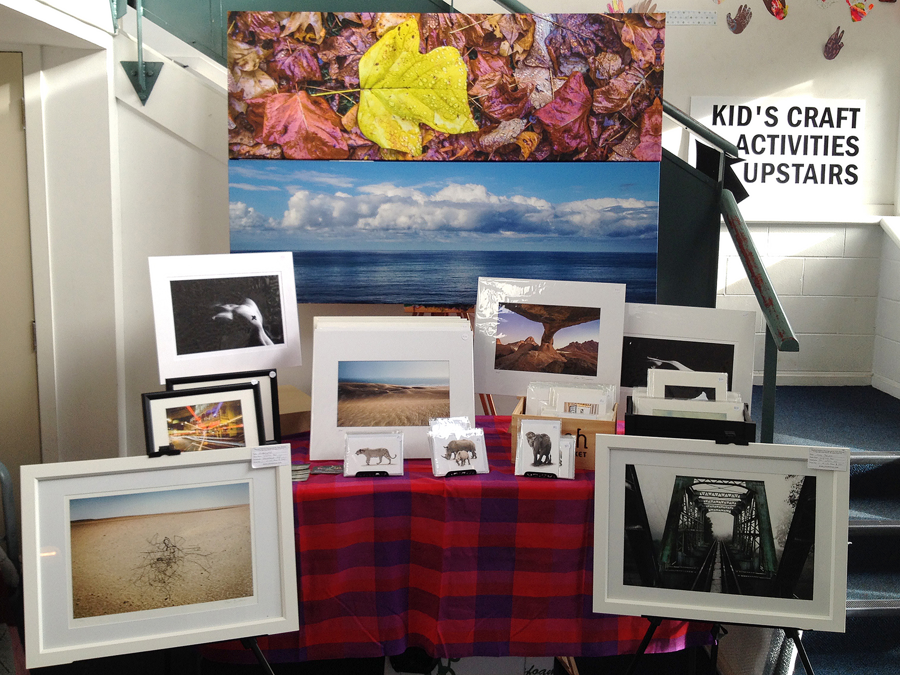
You finally get THAT call. The call you’ve been waiting for. The call that’s going to change your life, make you rich, make you famous. It’s the owner of the gallery down the road and she wants to see YOUR artwork. Portfolio tucked under your arm, you race down the road and arrive breathless at “the Little Shop of Art” gallery. You wait around the corner until your rasping breath recovers to almost normal, run a hand through your hair and enter.  The gallery owner looks through your portfolio with positive nods of the head and little throaty noises. She finally looks up with a broad smile and says she would love to show your work.” Yay, you think. “Can you send me over a set of digitals for the website and catalog by tomorrow!” she asks. “Sure thing” you reply nonchalantly. You head home walking on air. Suddenly it hits you. “Digitals?” You don’t have any. By the time you get home, you’ve hatched a plan. With artwork strewn across the floor and iPhone in hand you straddle the fruit of your labor and start snapping away. The pics look great until you zoom in and take a closer look. Bit blurry you conclude. Panic begins to set in. You call your mate with the DSLR to help out. He pops in and has a go. When you download the pics, the colour looks all  wrong. Uuugh…

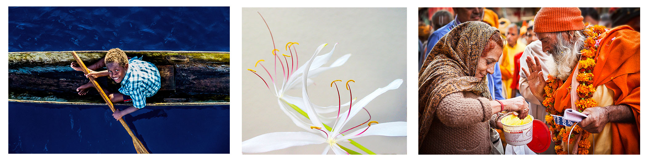
In this day and age of social media, online sales and marketing and print on demand, having a good quality set of digital images of your artwork is essential. In my profession I get to see some rather sad attempts at reproducing artwork so I would like to share some of the techniques I use on a daily basis. Good results can be achieved by either scanning or photography. In this scenario I am going to discuss photographing your artwork. To achieve the best results you will need the following; a decent camera, a good quality lens, a tripod and lighting.

  1. 1. Setup
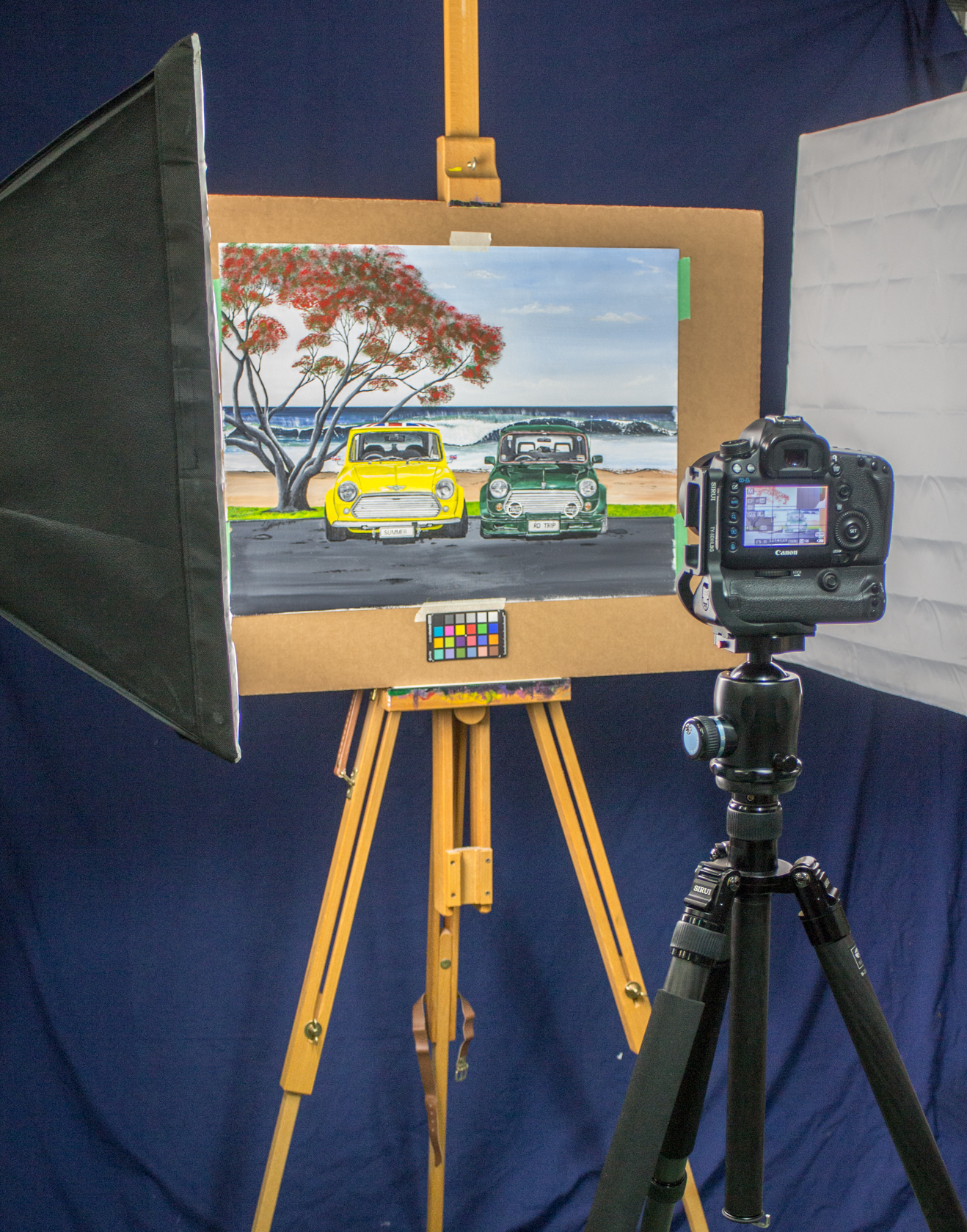
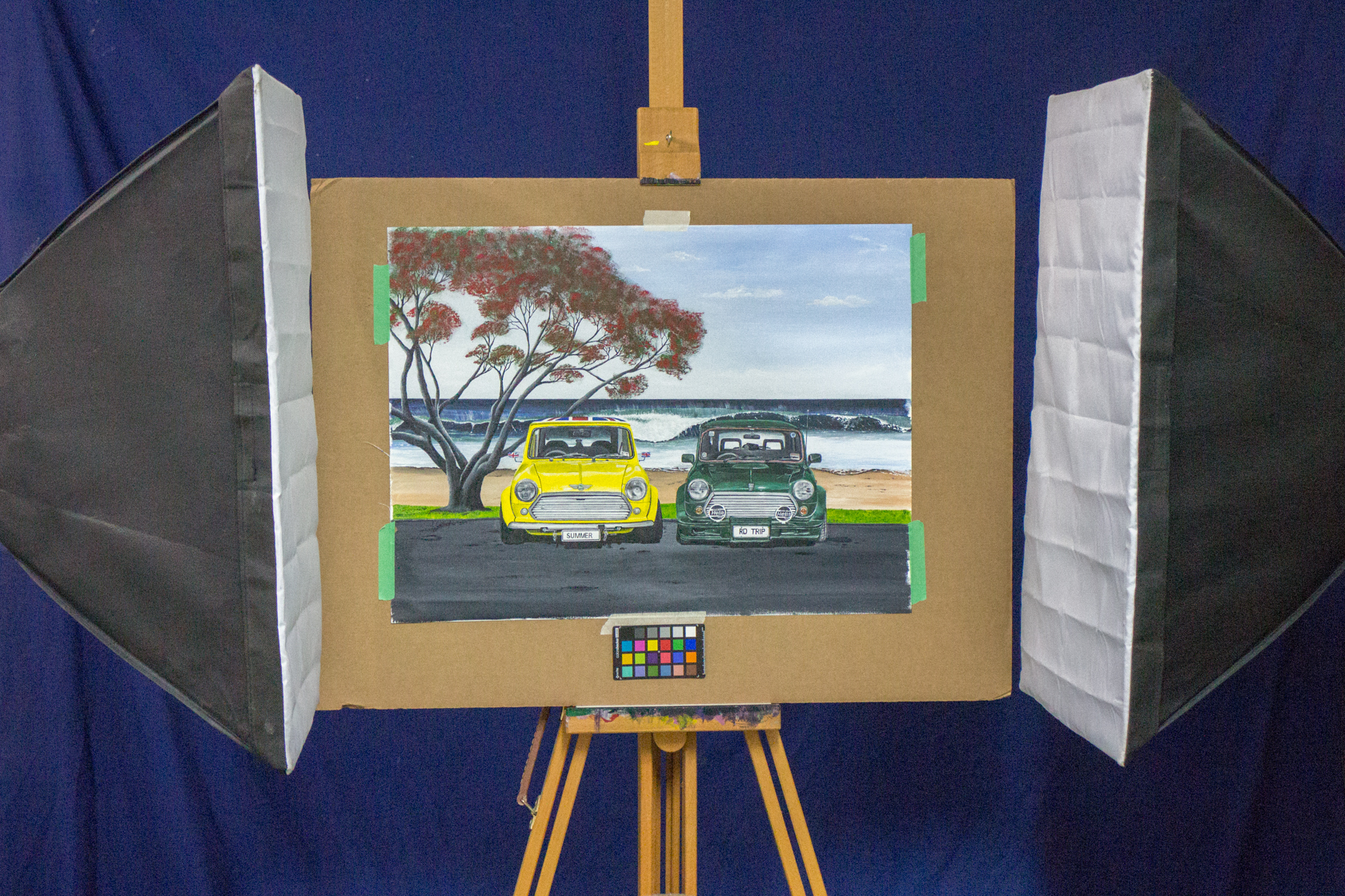
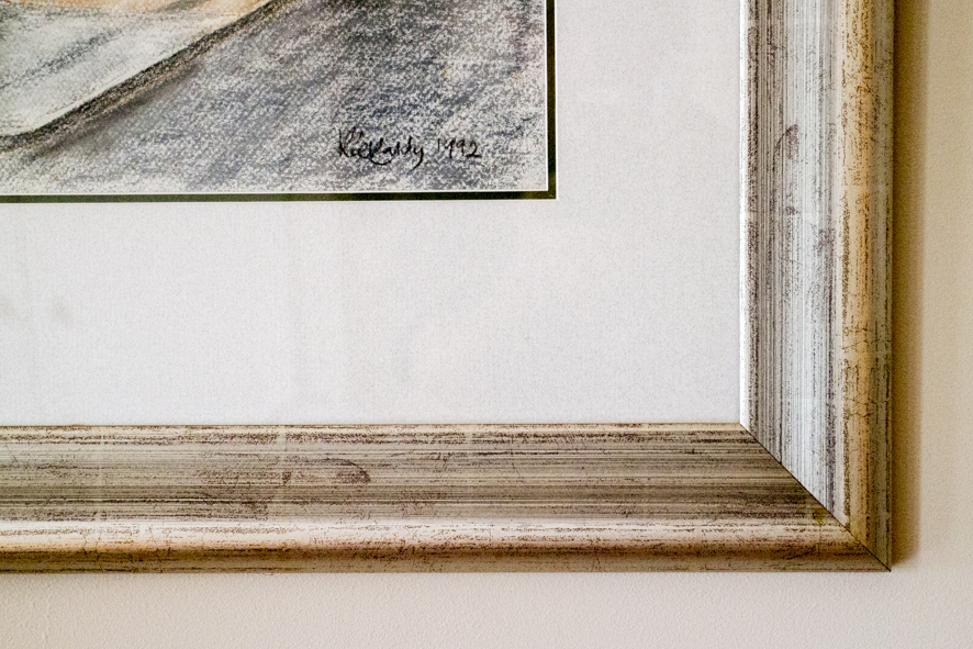
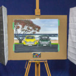
    Let’s begin by looking at some ways to set up your artwork for photographing. It’s best to do this before the artwork is framed which introduces a number of challenges like shadows and weight. Place the artwork on a solid support like an easel, against the wall using blue tack or if you have a tripod with an extendable arm, you can place the artwork on the floor. It’s essential that it doesn’t move during exposure.
  2. 2. Lighting
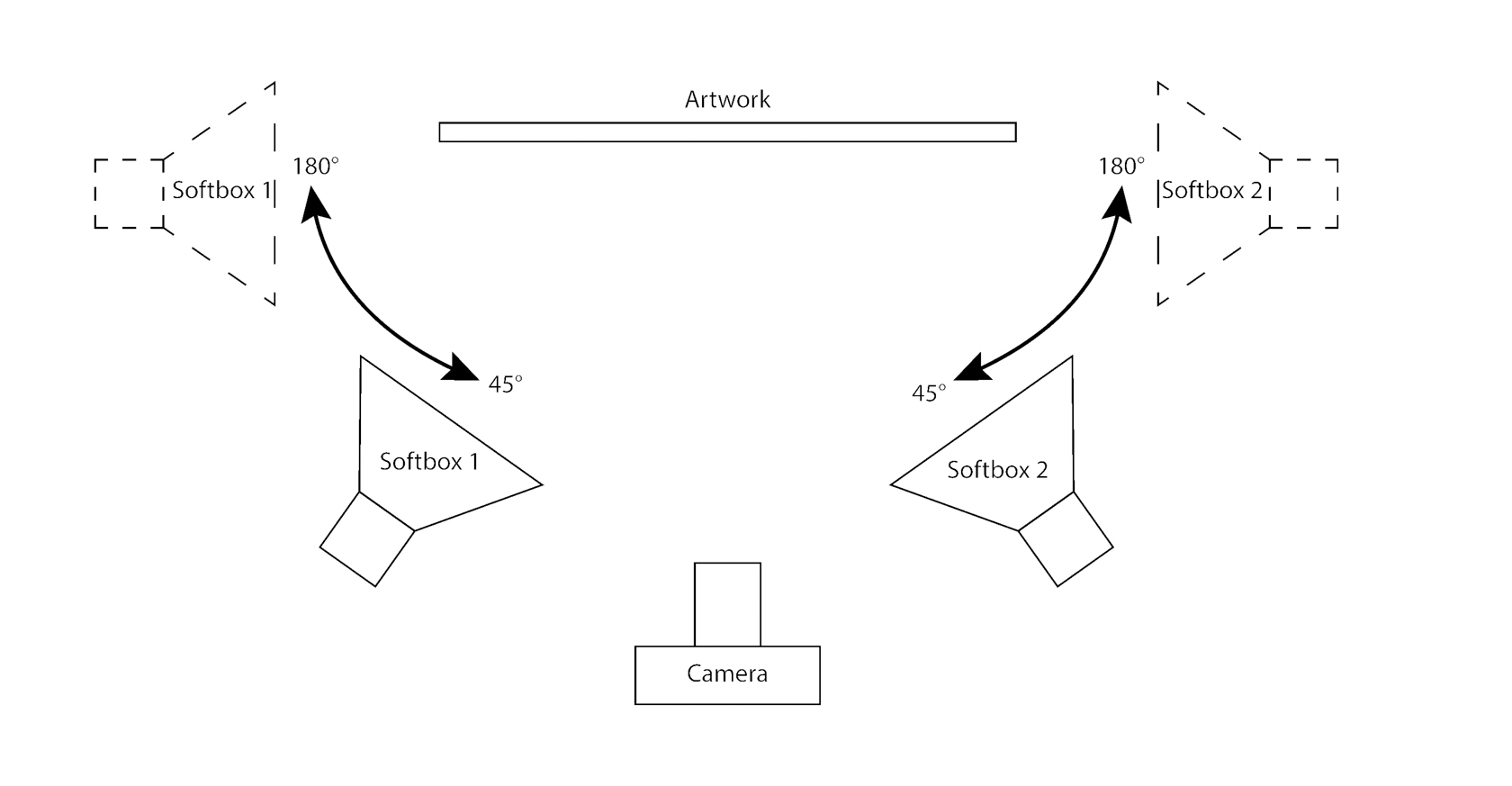
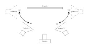
    The ideal lighting scenario is having two diffused light sources that will be set up on either side of the artwork. If you are going to do this frequently, it may be worth investing in some softboxes with D50 CFL bulbs or some flash units. Alternatively, indirect daylight will work well. In this case we will be working with two CFL softboxes with D50(daylight-balanced) bulbs. Different substrates like paper and canvas will pose their own lighting challenges. To begin with, place the lights at about 45 deg to the artwork on either side of the camera. When working with glossy varnished canvas try moving the light to the side of the artwork and let the light wash over the surface to minimize reflections. Move the lights along this arc during setup until you achieve the best results.
  3. 3. Camera, lens and tripod
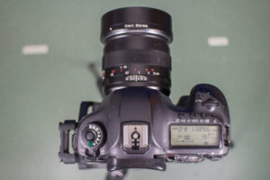
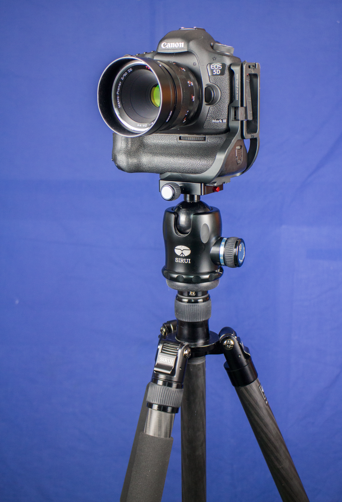
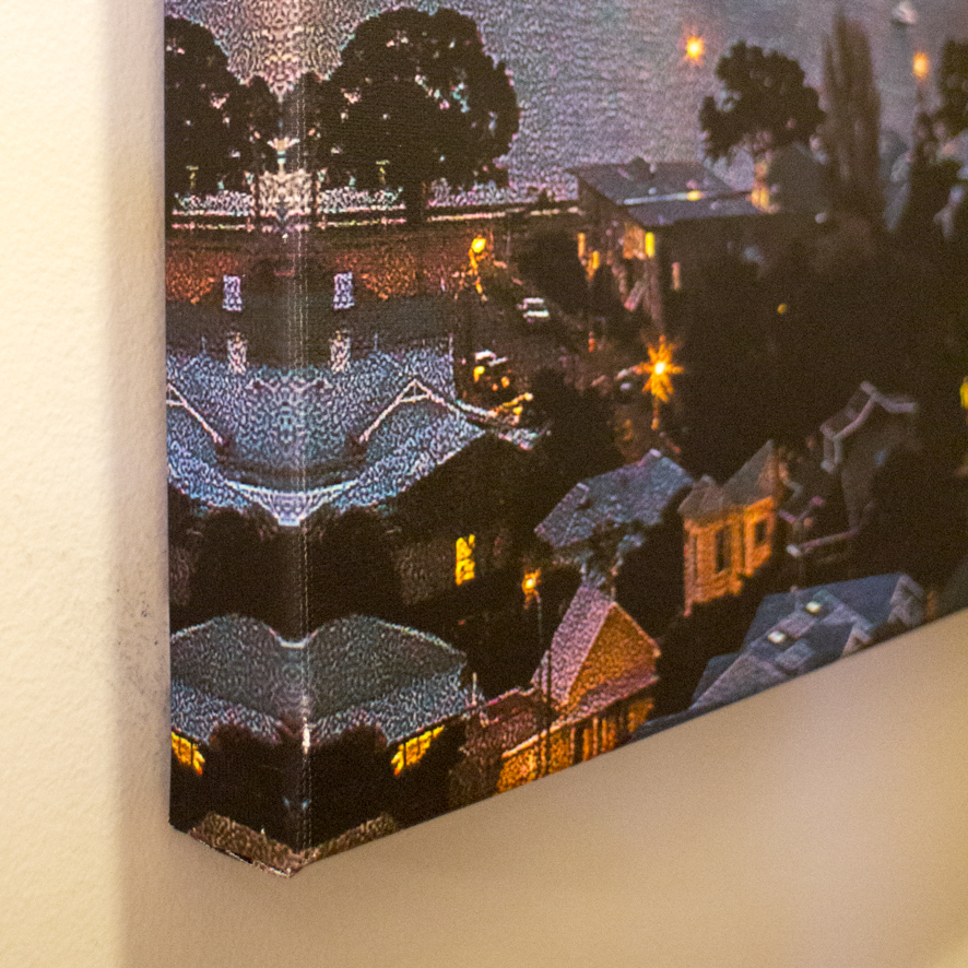
    Photographic equipment comes in all shapes and sizes and the price tag will rise to meet the quality. Always use the best option you have available. A point and shoot would be preferable to a Smartphone camera and a DSLR/Mirrorless would be even better. The lens you use is often more important than the camera and a 50mm to 85mm prime lens would work best. If however you only have a zoom lens, set the focal length above 50mm to minimise wide-angle distortion. Most lenses have an aperture sweet spot which is usually between f8 and f16(do a quick Google search to find yours).  Always place your camera on a sturdy tripod when photographing artwork, as handheld shots will usually have signs of lens blur at closer inspection. With your camera mounted on a tripod make sure that the lens is parallel/square to the artwork to minimise the parallax errors. Frame the artwork so that it fills as much of the frame as possible.
  4. 4. Settings
    Move the camera mode to A(aperture priority), set the aperture to around f11(or the recommended aperture setting from your Google search) and the camera’s ISO to 100. The higher the ISO settings, the more unwanted noise would be introduced. Most modern cameras have very good exposure meters, which in our case will determine the shutter speed, which will probably be quite slow (that’s why we need the tripod). Change the shutter release to timer mode (2 sec should be enough), this will reduce lens shake when you take the picture. To achieve the best results, your camera image quality should be set to the highest available; if it’s a DSLR/Mirrorless camera select RAW, else set it to the highest and finest jpeg resolution available. Finally set the white balance to auto mode. Set the lens to manual focus and magnify the preview screen to MAX and adjust the focus ring until everything is sharp.
  5. 5. Working with colour
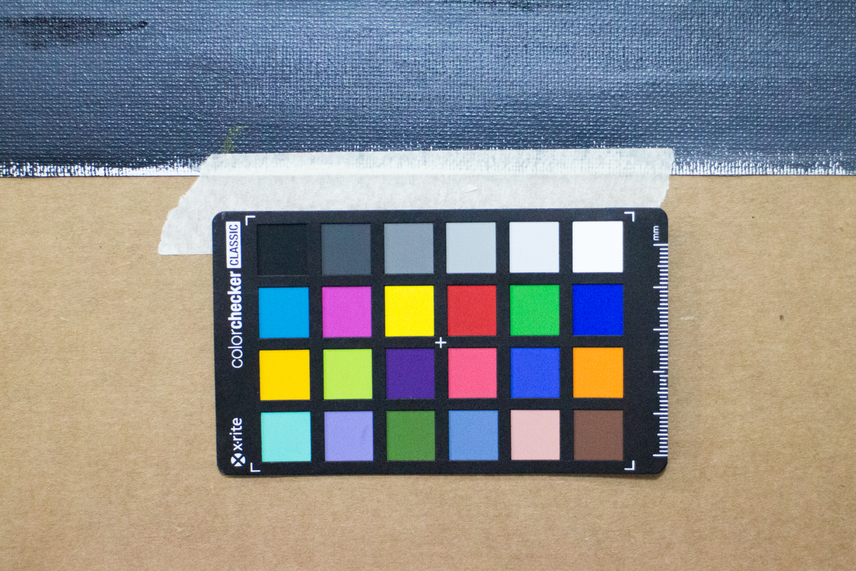
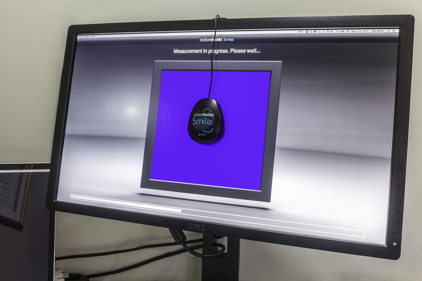
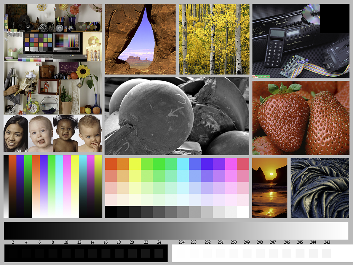
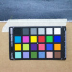
    The quality and colour of the lighting you use will have a great impact on the digital quality of your artwork. Even with the camera set to Auto White Balance, there will be a slight shift in colour. The best way to mitigate this is to use a 50% grey card or a X-Rite Color Checker, which can be purchased from most good camera shops. Take a photograph of the grey card/ X-Rite Color Checker at the start of every session using the exact same lighting and camera setup to be used later for colour correction.

I hope that these tips will get you on the right path making good quality digital images of your precious artwork. In the next part I will discuss the processing of the digital file.

Please feel free to email me on info@printart.co.nz if you have any questions.

The Business of Art

_MG_5646

During my recent visit to Sydney I popped into one of my fave hangouts, the Art Gallery of NSW and headed straight down to the photographic exhibitions (why do galleries always bury photography exhibits in the basement?). I was surprised to find a number of pieces by Andreas Gursky, who’s name didn’t mean much to me until a few years back when one of his photographs sold for over 3 million dollars. While contemplating the huge print of “Chicago, Mercantile Exchange” (it was estimated to sell for over five hundred thousand Euros), I got to thinking about the first time I presented my photography to the owner of the Red Square Gallery in Cape Town. I now cringe at the thought of how naive I was; I just arrived at the gallery without an appointment, my work was very poorly presented and was very higgledy-piggledy to say the least with no structure or cohesive theme. The gallery owner was very polite in rejecting me but it took me ages to come to terms with it. So how do you go from aspiring artists to commercial success?

_MG_5649I decided to find out more about this “business of art” so I headed off to have a chat with an expert in the field. I managed to track down Lisa Rodgers, the curator and general manager of Lake House Arts in Takapuna, who has been involved in the business of art for many years. I started by asking her how artists should go about approaching a gallery with the intention of getting their work accepted for exhibition. “What I’ve developed over the years is an exhibition proposal guideline document that asks about the artist and their practice, some images of their work and an artists CV that covers details like where you have exhibited and where you studied” explains Lisa. As a professional in the world of art, she undertook a research project around how artists should best approach galleries, casting her net far and wide to cover both private sector and publicly funded institutions. When the results were distilled, this seemingly daunting task came down to a few simple guidelines; “Make an appointment. I get a lot of artists coming in with a whole lot of artworks in their car and have the expectation that I can drop everything and have a half hour chat with them. While I’d love to do that as it would make my life much more fun, in reality it doesn’t work like that. If you want to get picked up by galleries and get exhibitions and you want to ultimately make sales and gain a reputation and get yourself out there, you need to treat the way you do it as a business” adds Lisa.

So, there was this thing again, the business of art; being professional. Isn’t art all about messing about in your studio and being all creative and stuff? Aren’t artists allowed to be, well, just arty and happy go lucky? Lisa has some strong views on this. ”Being arty and disorganised is a bit of an excuse. It comes down to professionalism, being organised. If you say you will deliver something by a certain date then you need to stick to that. My exhibition contracts will have a timeline of when things need to be delivered so there’s no excuse.” Lisa is herself an artist and prides herself on being organised and professional about her own art. “It’s a skill that can be learned and more institutions are including this in the art courses which is evident in the many emerging artists that I deal with. So there is no excuse. If you follow the guidelines and deliver the information that I ask for, you’ll probably get an exhibition. If you want to do this as a career, you can’t think about it as a hobby.”

There are many community galleries similar to Lake House Arts that operate on a ‘not for profit basis’ and are constantly on the lookout for new and exciting works by a wide range of artists. But bear in mind that these facilities have limited wall space, time and resources, so there is fair competition that you will be up against. Lisa concludes, “there is a good chance of getting your work exhibited if you follow the simple guidelines outlined by the gallery.”

_MG_5653Here are my top tips for succeeding at the business of art.

  1. Get organised – make sure you know what is expected of you when you approach a gallery
  2. Make an appointment – don’t just arrive and expect the gallery manager to be able to spend time looking at your boot load of artworks
  3. Read the proposal guidelines – most galleries make guidelines available for download or on their website
  4. Be reliable – know what is expected of you and by when and then deliver on time.
  5. Finished artwork – ensure that your artworks are ready to hang, not wet, incomplete or falling apart
  6. Artist’s biography – you should have a well-written artist’s bio ready to go. Get someone to proof read and help you edit.
  7. Artists CV – thius is different from you bio and should detail your experience as an artist including details of where you’ve studied, examples of your work and where you have exhibited
  8. Exhibition concept – a well thought out idea of what you are proposing that includes visual examples will go a long way to getting your work on the wall
  9. Photographs of your art – have a selection of images ready to go that closely represent your work for proposals and publication in catalogues
  10. Have fun – the more organised you are the more fun the business of art is.

So if your art is becoming a business it’s time to get up, dress up and show up to give yourself the best chance of succeeding. Go out there and create, print and share.

Artist Profile – Kristin Ivill

_MG_5692Joining The Dots

I first met Kristin when she breezed into my studio clutching a portfolio folder full of artworks she wanted to get copied and printed. While pouring over her work, it took me some time to realise that the exquisite images were made of thousands of dots, dots of all shapes, dots of all sizes, dots of all hues. My only point of reference was to imagine that the dots were like pixels in a photograph. I went along to Kristin’s studio to see if she was in deed going dotty.

JB: “Give me a little background to your beginnings in art and your training?”

KI: “I’ve always loved art. My mother was arty and my grandmother was quite crafty. She spun wool. She dyed wool and wove fabrics. My grandmother would take me around the farm and we’d go hunting for birds and bugs and look at the trees and she would tell me all about the native fauna and flora. So that’s where my love of birds and nature stems from. I did art at school until year eleven when my art teacher told me to give it up. She said I had no talent. So I stopped doing it and focused on art history in year twelve which I loved. That’s where I was exposed to Seurat who did pointillism. But that was the end of that so I left art and got married and had children. So when my daughter was born I did a bit of painting again because we needed some art to fill the walls. I got some canvases and paint and just started painting and it went from there.”

150325-Kristin_Ivill-birdsJB: “When did the birds fly into the picture?”

KI: “It’s only in the last five years that I’ve concentrated more on my birds. I grew up with paintings hanging in my parent’s and grandparent’s home by Rei Hamon, a New Zealand artist who did a lot of dot work, working in the pointillism style and that influenced me a lot. I picked up some pens and just started and I thought I quite enjoyed that and it just evolved from there. And I like going back to it, circles, a sort of Aboriginal influence.”

JB: “Did you have any formal art training?”

KI: “My studies were more about art history so learning about the artists and their techniques. For me it’s been more Internet based training. If I want to learn how to do something, I’ll just Google or You Tube it and go from there. About ten years ago I met a Russian lady who was doing adult art classes up at Selwyn College and she would offer guidance when I asked. She was fine art trained and helped a lot with colour selection so it wasn’t formal. She’d encourage us to draw every day so the more you practice the better you get.”

_MG_5673JB: “Tell me about your pointillism technique.”

KI: “I always draw and sketch what I want to do first to get the proportions right and once I’m happy with that I’ll transfer it to a good piece of paper. If I’m doing a bird or animal, I’ll always start with the eyes, which sort of brings it alive for me and slowly work my way from there. I normally work from a photograph as a reference.”

JB: “What materials do you prefer to work with?”

KI: “I use pigment pens. Artline and Stadler are my two favourite pens because they have good pigment colour. If I work in black and white I use the different thicknesses to give me the light and dark shades.”

JB: “How do you see your art evolving?”

KI: “I start with the pointillism and then I want to try something different. But then I’ll come back to it. I come and go so I’ve never been able to stick to one technique forever and ever because there are too many other techniques that are lovely as well. At the moment I’m doing a painting but I can see my dottiness coming through, I’ll start dabbing on paint in big dots. At the end of the day art is my passion. I have to do it. It’s my time out that doesn’t involve my husband or kids.”

JB: “What’s your craziest art moment?”

KI: “It was a few years ago. Everyone had gone off to work and school and I had this giant canvas down stairs. I painted for six hours solid. I was just manic, painting this field of wild flowers. My husband came home and said wow, I like that. It’s still hanging in our lounge.”_MG_5660

JB: “What inspires you?

KI: “Nature, always nature. I find myself stopped at the traffic lights looking for a pencil to sketch out an idea, too many ideas to get them all out.”

JB: “Do you see your art as a business?”

KI: “I’ve never thought of it as a business. I just have to do it. Selling it is a bonus but I end up giving it away mostly to charities just to put something back. At the end of the day the sales help to cover my costs so I can buy more pens, buy more paint, buy more paper. It’s a means to an end really.”

JB: “If you could take a year sabbatical what would you do?”

KI: “That would be amazing. I would go to my favourite place, Tiritiri Matangi Island and stay in the dock house and take lots of photos and draw from real life. Just to get out in the fresh air with the birds and nature and make sketches then take this back into the studio and paint and draw and dot but from sketches from being out in the open.”

feathers layout 2JB: “Tell me about your recent picture-a-day art-a-thon.”

KI: “So the first one I did was ‘Inktober’ on Instagram. You could do a drawing a day for the whole of October on anything you like. Mine ended up being New Zealand themed. I found that if I tell people I’m doing it I have to do it. I have quite a few followers on Instagram now and I didn’t want to disappoint anyone so if you tell them you’re doing this thing you have to do it. I quite enjoyed that so I decided to do one myself in February, which turned out to be feathers. I found that the more I did, the better I would get. I would get home in the evening, get the house work done and sort the kids out then get on with my drawing. Sometimes it would be until midnight because I had to get it done that day.”

JB: “How important is social media in your art?”

KI: “I set up an Instagram account to keep an eye on my kids and then it was posting the odd picture and then it just evolved into being about my artwork. The more comments I got and the more followers I got the more confidence I got from that. And soon you have a whole lot of artists that you’re following and that are following you and it’s like a community. So that led me to setting up the art page on Face Book to get it out there. I’ve made a lot of sales through it, especially Inktober on Instagram so it’s a good way of marketing your art. But the community support through Instagram is amazing. I feel like I have a lot of friends all over the world now, even though some of them I’ve never met. We talk almost every day and share our art. It’s probably the main reason I am where I am today. It gave me the confidence to sell my artwork and not just fill up my walls.”

You can find Kristin on www.instagram.com/kristin.ivill.art and www.facebook.com/kristin.ivill

Expose Yourself

John Botton - Ready Made Frame I’m not sure about you but I always feel a bit self-conscious when exposing myself to other people, especially in public. What I have found over many years though, is that it pays to ensure you are presenting yourself in the best possible light. OK, so maybe you think I’m a bit of a pervert… but what I’m actually talking about is showing my fine art photography (so who has the dirty mind now ;-). After labouring long and hard over your masterpiece it’s worth making the effort to present it with the same care and attention you took over its creation. After all, it’s often the packaging that intimates at the value of the artwork; much like a Michelin star chef who presents his fine cuisine, not as yummy food but as a work of culinary art.

As a fine art giclée printer I get to print some really stunning artwork and as a photographer, my presentation knowledge and experience is centred mostly around my own work. Custom framing artworks for display can be an expensive exercise and may be beyond the budget of artists that are just getting going, so I have come up with a couple of presentation ideas that should suite most pockets.

Materials:
Regardless of what presentation method you choose, the quality of the materials you use will play a significant part in the appearance and longevity of your artwork. Card stock, paper and tape all contain acid which will yellow over time, contaminate your substrate and may even render your work of art worthless. As with drawing materials, always select the best possible materials you can afford for preserving your works for future generations to enjoy.


John Botton - Polly Bag and BackingPolly Bag and Backing:
The simplest and most cost effective way of presenting your work is in a good quality re-sealable polyurethane bag with a stiff backing card. This is especially true if you are presenting your artworks at markets with loads of grubby paws flipping through display boxes. It protects the artwork and allows you to slap on an artist’s bio sticker with details of the piece. Just make sure the bags are crystal clear and of a high quality without any visual distortion.


John Botton - Matte DetailMatted and Backed:
One step up from the polly bag and backing option is to have your artwork mounted in a custom matte board with foam board backing. Once again, select acid free matte board and tape to preserve the longevity of the work. Make sure that whoever does the matting for you practices conservation framing methods. The matte board will serve as a frame and with the right colour choice, focuses the attention of the viewer without distracting from the artwork. Unless your artwork has a unique dimension, the trick with matting artwork is making sure that the matte size can fit a standard frame size making it easy for the buyer to get it framed. The depth of the matte should also be appropriate to the artwork; here bigger can be better. A skinny matte border can appear cheap and not do your work any justice. If your art is on a handmade substrate or has a decal edge, floating the piece within a matte board will incorporating the edges of the paper in the presentation.


Mounted on Foam board:
This method takes a bit of planning, especially for original pieces, as you will need to allow for a border around the artwork on the page. It’s much easier done with giclée print reproductions or photographic prints where you have full control of the image placement and size on the paper. The effect is a simple and elegant presentation without any distractions. The trick with this is to ensure that the print is securely attached to the foam board backing and is best undertaken by a professional framing shop that has a vacuum mounting facility. Having said that, foam board is available in a self-adhesive option with good quality glue for the DIY enthusiasts.


John Botton - Frame and Matte detailsFramed and RTH:
Ideally, your artwork should be professionally framed and Ready To Hang. This gives you the opportunity of selecting a frame that would best show off the piece without distracting from it. Frame mouldings can vary vastly in style and colour so it’s easy to overstep the mark; select a simple frame style in a colour that brings out the best in your work. Ornate hand-carved guilt frames are best suited to old masters works hanging in galleries and to be avoided. Simply put, your frame should enhance not overwhelm your artwork. Custom framing can be expensive but if you shop around you may find ready-made frames of good quality that fit standard paper sizes (this is the option I choose most). Steer well clear of cheap snap on or plastic frames; these will tarnish your artwork and diminish it’s value (rather go the polly bag or matte option). If your artwork requires glass protection you are faced with the choice of plain, non-reflective, acrylic or gallery quality glass each with their advantages and price points. Pay attention to the hanging components and ensure they are up to the job of supporting the weight of the framed image.


John Botton - Canvas EdgeCanvas Stretching:
Stretched canvas artworks should be gallery wrapped and are deemed to be RTH and usually don’t require any framing; but framing is an option that can add an elegant finish. When working on canvas, make sure that you continue the image around the sides or alternately paint the sides in a neutral colour; it is a part of the artwork after all. Saw tooth hangers make it easier to hang the image and are definitely less fussy than attaching a cable. Make sure your canvas is securely stapled at the back, even if it’s purchased pre-stretched and that the staples are covered with paper tape to finish off professionally.


Your approach would differ completely if you were presenting your portfolio as a body of work to a gallery or doing a private showing for a buyer. Here you would want your work to be presented with continuity in keeping with your style as an artist.

Now go out there and expose yourself… Create – Print – Share

Preparing Your Honours Portfolio Display

I have had the pleasure over many years of printing exhibition images for photographers and none more challenging than an honours portfolio. Needless to say there is always a huge emotional investment when showing your work and especially if it’s to be scrutinised at close quarters by a judging committee. Here are a few steps that I hope will help you visualise your images before you go to the expense of printing and mounting the final photographs. For this exercise you will need access to Adobe Photoshop and your final selection of honours images.

  1. Open your images in Phoptoshop.
  2. Set the background as a layer (right click the background and selecting “layer from background” or Layer/New/Layer from background).
    Fig 2
  3. Set the canvas size to 50×40 cm for landscape or 40x50cm portrait.
  4. Create a new layer, drag it bellow the image layer and set the fill colour to 50% gray. This will represent your presentation matte.
  5. Select transform (Cmd + T) and hold down the Shift + Alt keys and resize the image layer until you are happy with the proportion of the borders. Hint – an info box on the top right corner will display the size.
    Fig 5
  6. Save you image as a .psd file in a new folder titled “Display” to preserve the layers for possible future editing (and so you don’t over write your hi-res file). Leave all the files open for dragging into the display.
  7. Do the same for the rest of your honours portfolio. Hint – create an action to do the basic setup.
  8. Create a new blank file with dimensions 594mm x 420mm and fill the background with white and save as “display layout.psd”. Set some equally spaced horizontal guides according to how you want your portfolio to be displayed (in my case three rows).
    Fig 8
  9. Go back to each image tab and flatten the layers. Then drag this to the master display image.
  10. Resize each image (cmd + T) so that the long ends are all the same(in the example I’ve used 120mm).
    Fig 10
  11. Now move the images around your display layout until you are happy with the results. You may need to go back the saved .psd file and resize the image/border ratio to get the balance right.
    Fig 11
  12. Save the final layout file, as you will need to print out a hard copy to accompany your submission.

Lastly let me say that this is by no means a guide as to what images you should display and in what order. It is merely a guide on how to visualise the final presentation and to get the landscape and portrait images into a visually appealing dimensions.

Preparing Your (Landscape) Images for Giclee Printing

By John Botton APSNZ

Most photographers I print for often ask for tips on how best to prepare their images for print. In reality, good prints start before you even hit the shutter button. Unlike the simplicity of good old film workflow, digital photography comprises a myriad interdependent systems and settings to achieve the desired output.

_MG_3996Lets begin with the origination, your DSLR camera (this may also apply to smart phone cameras in the future). Go into the menu settings for the camera and find the reference to “colour space”. You should have two options here, sRGB and Adobe RGB. Make sure you have Adobe RGB selected. ColorspaceBut what’s the difference you may well ask, having just shelled out a gazillion dollars for your new camera that should do everything perfectly. If you refer to the image, you’ll notice that fundamentally these refer to the amount of colours that these colour spaces can resolve. Now scoot over to the file format setting and make sure your shooting in RAW capture. You definitely want your image file to contain as much information as possible so stay away from shooting in JPEG. Unless, that is, you shoot only for the digital space like the Internet, web or social media then leave your colour space set to sRGB and just ignore the rest of this article. For the rest of you, read on.

photoshop colour space lightroom colour space

Also see: There’s More to Colour Than Meets The Eye

Before you capture your image, take the time to get your composition as close as possible to what your end image will look like. It’s no use having a large sensor capable of capturing 20MB files if your going to crop down to a fraction of the image you’ve taken and then expect your print to pop with detail and not be pixelated. Get to know your camera and lenses by experimenting with different settings and combinations. Don’t wait until you have spent loads of cash and time getting to an awesome landscape opportunity to start experimenting. Get out into your local neighbourhood and do a systematic incremental exercise of aperture settings for each lens in your bag and study the results critically. Get a friend to give a second opinion if you’re not sure. Every lens has a sweet spot, especially for landscape work.

John_Botton_NZArtist_002-0002With exciting advances in paper coating technologies and inks, modern printers are now able to resolve a much larger colour gamut which is made possible on most fine art printers by using up to twelve colour inks. But wait a moment; we’re jumping the gun a bit here. Lets take a look at your post click colour workflow starting with your image processing software. Check the user guide/manual to find out where you can change the colour space. OK, go there and make sure it’s set to Pro Photo. Now head over to your image editing software(if that’s different) and do the same. Now make sure your monitor is correctly calibrated so that what you see is what you hope to get… refer to my article on colour workflow. Now that you’ve made sure that your software isn’t inadvertently going to compress or alter the colours in your image file, lets take a look at preparing for print.

Start by doing as much processing on the RAW file as possible. This can be either you camera’s native RAW format or the file can be converted in the DNG(digital negative) format which is becoming an accepted standard. That means making as many changes as possible in Lightroom or whatever you may use before you start messing with the actual pixels. Editing the RAW file is non-destructive and has no direct effect on the underlying image file while editing a pixel based file can be described as destructive as the information that makes up the image is re-arranged and saved according to the changes you have made. When you are done making changes, export your image at the final print size and set the resolution to 300dpi. Don’t do any sharpening during the export process as you have no direct control over what the “black box” is doing to your image. Save the image as a .TIFF file and rename it as “file name – print” or whatever makes sense to indicate that this is your print out put file. Including details like file size in then name will help jog your memory in future and also communicate information to the person doing the printing.

If you are going to be working on your image in your favourite editing software, make sure that you are not saving the file in a compressed format like JPEG. Stick to either .TIFF or .PSD or similar. If you are using Lightroom and need to do additional editing, you can take your images into Photoshop as smart object that allows you to make non destructive edits that do not directly affect the RAW file. After completing your final edit, save a backup copy of your file in .TIFF format and rename it “file name – print final.tif” or something that will indicate that it’s the final print output file. Always remember to flatten any layers to ensure that no unwanted changes occur when the file leaves your control. If you are not doing your own printing, don’t do any print sharpening or soft proofing, leave that to the print operator.

John_Botton_NSPS_Bowron-0007

Your image is now finally ready for printing. Yippeee! So, as you can see, a great print starts when you’re out there, perched on the edge of the world, freezing your butt off, waiting for the light. Get out there and CREATE – PRINT – SHARE.

www.printart.co.nz

Making Inkjet Prints Work For You

Photo BoxAs a fine art photographer I have never had any problems with creating content, it’s what I love doing, but the challenge arises when it comes time to decide what to do with many of my images. I don’t know about you, but I have a catalogue full of photographs that just don’t make the cut; don’t get me wrong, they are great images, but just not “fine art”. So the question remains, how to monetise the time, effort and materials that went into the creation process. So here are a few ideas for you to contemplate.

Making Calendars
Yup, I hear you turning your nose up, but before you toss the baby with the soapsuds, hear me out. Making a calendar these days is as easy as pie and a great way to create gifts that keep on giving, well at least for a year. There are a number of really slick websites out there that give you full control (well nearly) over the whole creative process. Just register an account, select from a range of templates that give you a readymade calendar, upload your images and decide which pic you would like to feature in January, February, March and April and… you get the picture! Then just click order, pay your money and Bob’s your uncle.

Vista PrintOK, so it’s not THAT simple. The trick to using any of these self-help calendar creation websites is preparation. Once you have decided on which service you prefer, find one of the templates that would best suit your work. These range widely from single landscape format layouts to multi image affairs and in many cases, you can mix and match from month to month. The secret is, keep it simple, decide on a style and make use of this for the whole calendar. If you haven’t already done so, the next crucial step is getting good quality digital images of your artwork (see previous article on this). Make sure your images are finished as you would like to present them, have a resolution of at least 300dpi at the correct size and are saved as hi resolution .jpg files (or whatever the file format is suggested by the service you’ve chosen). While preparing your images, keep your chosen layout in mind and make sure that your images will slot into this format. You may need to do some cropping to keep the presentation consistent, as most of the services don’t have any image editing options. Pay special attention to the front cover image of your calendar, it has to be eye catching and say “This is my work” loud and clear, whatever your style.

Here are a few of the sites that I investigated:

  1. http://www.vistaprint.co.nz/
  2. http://www.printing.com/nz/ – longer print runs from 25 units
  3. http://www.photobox.co.nz/
  4. http://www4.snapfish.co.nz/


While you’re checking out these sites, take a look at the other products they offer. You could even come up with a new range of coffee mugs or mouse pads.

Canvas Prints

After chatting to many artists who sell their work at markets, the one thing that I have learned is “ready to hang” is king of the pops. Gift and wall art hunters who frequent these spots are often looking for artwork that they can take home, pop on the wall and enjoy without the hassle of getting it framed, or give as a gift knowing the recipient won’t have a similar challenge. A simple solution is stretched canvas prints. OK, so canvas prints may not match up to fine art prints on super luxurious, cotton, archival paper but the quality of modern materials and printers puts them up there with the best and there are definitely pure cotton archival canvas options available… at a price of course. I guess the first naval you must contemplate is “does your artwork lend itself to canvas?” It doesn’t have to be originally created on canvas to suit this form of presentation, but with some careful thought and imagination, many images are adaptable to canvas prints.

So, where to begin? Well as before, any artwork that’s going to be printed needs to be digitised and saved as a 300dpi .TIF image at 100% of the final print size. Once you have your artwork as a digital image, you can even do some creative stuff in Photoshop by creating a montage. Just an idea 😉

The most important decision you’ll make on this venture is the price point you are aiming to sell at. This largely influences all your other options you need to decide on.

  1. Canvas quality: this will vary from low cost Chinese polly/cotton blends to archival quality cotton products made by some of the top paper producers in the world like Hahnemuhle, Breathing Color and Canson. The image detail, clarity and colour reproduction will vary markedly from one end of the canvas spectrum to the other. Like art paper, canvas also comes in different weights; the heavier canvas will hold its shape for longer after stretching.
  2. Printing: again, the print quality will vary from inexpensive 6 colour machines to top end 12 colour giclée printers. Inks may also be rated as archival, so if you’re printing on a good quality cotton substrate, it makes sense to use good quality pigments.
  3. Stretcher bars: selecting the right depth of frame for canvas prints can have a marked impact on the artworks perceived value. Going with a skinny frame on a large piece will say “I’m cheap” while a deep frame even on a small piece will give the impression of a “work of quality”.
  4. Varnishing: light is the single worst enemy of any canvas print and direct sunlight could render even a well printed archival artwork to faded junk in a few years. Good print companies will usually varnish their prints with either a gloss or satin UV protection that should offer protection from light, as well as allowing the surface to be kept clean with a damp cloth.
  5. Edge finishing: what to do with the edge of the canvas print is a personal matter (that’s the bit that wraps around the stretcher bars). The most popular options are mirror the image, which makes the image appear to wrap around the edge. Mirror and blur the image, this will give a similar effect as above. Do like the Stones and paint it black or just leave it white. Then again, if you’re a purist you may want the actual image warped around the sides. Whichever way you go, it’s something to think about.

Here are a few printers that I have investigated:

  1. http://www.digitalprint.co.nz/
  2. http://www.harveynormanphotos.co.nz/
  3. http://www.photobox.co.nz/
  4. http://www.printart.co.nz/

Wishing all my fellow creative peeps a safe and prosperous festive season. Go out there and CREATE – PRINT – SHARE

Why Giclée Print?

credit Ane Chambers - 1

Cards by Ane Chambers

You push your chair back from your workstation and admire your handiwork. “Another masterpiece and in record time” you declare loudly to Phatt the ginger cat who’s perched on the sunny windowsill, barely taking any notice of your apparent excitement. The gazillion dots that make up the intricate pointillist pixilation stare back at you. Just then the phone rings, it’s Marge from the gallery. “Darling, can you get another five of the red ones, three greens and a blue to me by Friday, sales are going through the roof.” “No problem”, is your reply. Your artwork is really selling well, but you don’t seem to be making any money. You start counting on your fingers and before you even get to your toes you’ve worked out that after gallery commissions deducted you’re making $22 an hour for your efforts and that’s not counting the cost of your materials. There must be an easier way to make money as an artist.

credit Kristin Ivill

Pointalist Birds by Kristin Ivill

Of course there is, by making high quality geclée(a fancy word for inkjet) prints from your originals. “But isn’t that cheating?” you ask. No not at all. Even way back before pop fell off the bus the grand masters were making copies of their works. Well, not exactly Xeroxing but rather making copies by employing a team of lowly paid apprentice artists to replicate their masterpieces, brush stroke by brush stroke, leaving the “artist” more time to create new works. With modern printing technology, it’s a few clicks of the mouse (and a few tricks of the trade) and viola, you have an almost exact replica of your artwork. The quality is so superb it’s sometimes hard to tell the original from the reproduction.

But who would want to shell out their hard earned cash for a copy of your work, even if it’s a limited edition print on fine archival paper? The answer is… loads of people. Just take a walk down to your local gallery or weekend craft market and you’ll be surprised how many artists have realised that it’s not cheating, but just good business sense.

And with the “Big C” lurking just around the corner and I’m talking about Christmas here, now is probably a good time to start thinking about ways that you can monetize your original creations. The limitless potential market for your art reproductions is up to your imagination. Let’s take a look at the possibilities.

Credit Varvar 2076 - 2

Digital Images by Varvar 2076

Straightforward prints are probably the most obvious option here. These can be limited edition prints reproduced on beautiful cotton based archival paper, numbered and signed by the artist. Sweet. Or they can be open edition prints targeted at a wider audience. Whichever options you decide on, there are a few things to bear in mind such as print size, paper quality, presentation and pricing. If you’re planning to sell your prints un-framed, plan your print sizes to fit standard frames like 8×10 or A4 etc., and if you are doing your own printing it’s more economical to limit the variations in size to two or three per image. Paper quality also varies greatly and will have a direct effect on the price you charge for your reproductions. Do a little online digging and look for printing services that offer more economical paper options, without compromising on print quality. Finally, presentation is almost as important as the prints themselves. Know that your prints will be manhandled by browsers looking for that ‘something special’, so slipping them into a cellophane sleeve or wrapping, sandwiched along with a stiff backing like foam board will help to protect it.

Forest Animals by Lize Upton

Forest Animals by Lize Upton

While prints are the stars of the repro world, the unsung heroes are cards; Christmas cards, greeting cards, birthday cards and just cards for card’s sake. Cards come in a myriad of shapes and sizes ranging from single sheet post cards to elaborately folded contraptions. Laying out your cards can get a bit tricky, so make a mock-up on some cheap paper or solicit the services of a tame graphic designer before committing to expensive prints. Unless you are creating custom made envelopes, take the time to scout around stationery stores and the two-dollar shops for suitable packaging, before you finalize your design. It’s simpler to cut your card to fit your packaging.

credit John Botton Photography

Photo prints by John Botton

But that’s not the bee all and end all for artwork reproductions. Your artwork may best be suited to printing on fabrics. I’m thinking here about T-shirts, aprons, caps, scarves or even mouse pads. Beware that to achieve decent results with short print runs may require a dye sublimation process and this can be expensive. There are some inkjet printer friendly heat transfer papers available, but the quality will never match up to dye sub or screen-printing.

Some things to keep in mind when you head down the print reproduction road, the final product will only be as good as the quality of digital image you present to the printer. Start with digitizing your artwork at the highest resolution possible. In simple speak, that means the image file should be at least 300dpi at 100% size and saved in an uncompressed format like TIFF files. You may end up with very large files and your hard drive will be in for a rude shock but it’s worth getting it right. If all this seems like double Dutch to you, your best option may be to solicit the services of a professional.

Go forward and multiply. Create – Print – Share


Auckland Festival of Photography

auckland festival of photographyWhile I was visiting Tauranga for the annual convention for Photographic Society of New Zealand in May I received consecutive calls from two of Auckland’s pre-eminent photographic organisations asking me if I was able to print their clubs exhibit for the upcoming Auckland Festival of Photography. What an honour. Absolutely I replied. On my return to my studio in Albany I was inundated with work. The festival is an annual celebration of photography and showcases some of the regions emerging new talent alongside established artists. The primary aim to to raise awareness of photography in general and photography as art in particular.

The first to contact me on my return to base was Steve, the president of the Eden-Roskill Camera Club. This club  has been in existence for half a century and has recently undergone a resurgence in both membership and the standard of photography. This would be the third consecutive year that the club has assembled and displayed a body of work produced by their members at the Auckland Camera Centre on New North Road. Their portfolio represented a range of work from their newer C Grade members to their more experienced A Grade artists end everything in-between. All in all there were 34 images for processing and printing.eden-roskill

This frenzy was followed soon thereafter by a visit from Roger hammond, the president of the Auckland Photographic Society based in Remeura.  Another 42 images chosen from their members body of work through a stringent selection process we loaded onto my workstation ready for processing. Established in 1883, APS is probably one of the oldest clubs in New Zealand and judging by the quality of their work, still going strong.

The week that followed was a well oiled workflow process of soft proofing each image. Fortunately all images were to be printed on Breathing Color’s Vibrance Luster, a semi gloss photo paper perfect for this type of project because of it’s wide colour gamut, great Dmax and amazing detail. This certainly simplified the proofing process. The printing workflow was equally as slick with the combination of Colorbyte Software’s Image Print RIP and the Epson 7900 wide format printer. The predictable output and performance of my digital workflow from file to print resulted in all images being printed on schedule with no waste of either time or resources.

aps-bwI must admit that mounting and matting 80 plus images(not including 20 images being printed and mounted for the North Shore Salon) can be a little tedious to say the least, especially with a deadline looming. Given that each image  had unique dimensions, each matte needed to be measured and cut individually. Knowing that hoards of viewers would be scrutinising each photograph each mount had to be produced to the highest standard. Fortunately I thrive on such challenges and continually challenge myself to improve and work smarter as the task unfolds. When I finally completed the tedious task, I was rewarded with the sight of several stacks of neatly piled mounted prints ready for display.

It is with great pleasure that I visited both exhibitions. Personally for me, there is something special about viewing a collection of great images in the printed format. It’s the ultimate way that artists are able to really share their creative intent.APS-colour

There’s More To Colour Than Meets The Eye

colour-stripSo, after agonising over your laden pallet for hours and carefully crafting the exact colours you envisioned, you’ve finally put the finishing touches to your next masterpiece. Then, remembering that Aunt Agatha had requested a copy of the piece, you whip out your iPhone 5s and snap a few shots. But when you pick up the prints from your local “Mega Store”, there’s a dull lifeless image staring back at you. The colours are nothing like what they should be. Sound familiar?

John_Botton_NZArtist_002-0010When it comes to reproducing your artwork, whether it’s for record keeping purposes or print reproduction and sale, there’s a lot more to managing the colour workflow than you might think. Firstly, you will need to think about the quality of the light used to illuminate your artwork, then the colour settings on your camera, followed by the digital colour space and the format that your camera uses, to record the image file. When you finally download your images onto your computer, your monitor will play an important roll in the display of your images accurately and if you are going to print your images, it finally comes down to the quality of printer, ink and paper you choose. If this all sounds like a quagmire of potential disaster to you, maybe it’s time to take a closer look at your colour workflow.

As an artist, you are probably keenly aware of the colour of light. Fortunately modern digital cameras have a similar ability called “Auto White Balance” which alters the captured image to emulate daylight. Make use of this as a starting point, bearing in mind that the optimal light source for photographing artwork is, even illumination. This is best obtained from daylight balanced soft boxes in a controlled studio environment. But, if you only have a couple of desk lamps handy, fit daylight or “cool” light bulbs and try covering the shade with tracing paper to defuse the light. It’s important to note that the colour of the light will affect the colours of your printed artwork.

Keep in mind the old adage of GIGO, Garbage In Garbage Out, when you start taking pics. Set the tripod-mounted camera to record images at the highest setting available. If possible, the best is to record RAW or TIFF files that will allow you to make changes to settings like white balance and exposure later without loosing any quality. You can always compress the files into a smaller size later, but you can’t add information that isn’t there.

John_Botton_NZArtist_002-0001
The next few stages of making a decent looking print for Aunt Agatha is going to get a bit technical, but she’s definitely worth all the fuss. When you start editing the images you’ve downloaded onto your computer, it’s essential to have a monitor that is correctly calibrated. You can do this yourself by eyeballing the display and manually adjusting the hue, saturation, brightness and contrast until what you think you see, is what you think your masterpiece looks like in real life. Or you can do it the easy way and use a display calibration gizmo like the Xrite ColorMunki, or any number of similar tools, just plug in and play.

John_Botton_NZArtist_002-0014If you are using Lightroom, Photoshop or similar image editing software to make the final adjustments to your digitised masterpiece, you will have the advantage of any number of controls to get your image to look exactly as you want. But even if you only have the basic freeware like Google’s Picasa available, there are still a number of adjustments that can be made to get the best from your efforts. Try adjusting all the settings one at a time, moving from one extreme to the other, to get an idea of what the do. As long as your monitor is calibrated, what you see on the screen is what the print should look like. Right? Right!

John_Botton_NZArtist_002-0002The final stage before laying down some ink is deciding what paper would best suit your work of art. Just as in the art world, there is a multitude of choice in printing substrates available (that is in itself a whole new discussion). For now, let’s assume that your magnum opus will be reproduced on a hot pressed fine art cotton based lignin free blue wool 5 archival paper, with no OBA’s. But before you reach over and press the print button, you will need to “soft proof” your image to ensure that the printer will indeed print what you see. In the bad old days, it was a process of trial and error, making a print, going back to the computer, making some adjustments and re-printing, resulting in a huge waste of time and materials in this tedious process. Fortunately, modern printmakers have tools such as soft proofing at their disposal. Soft proofing, usually done in Photoshop, entails the use of skilfully crafted ICC (International Color Consortium) printing profiles, a software filter that makes subtle changes in the printer’s instructions, to get the best results from the selected paper/printer combination. This ICC profile changes the display to simulate what the printer will actually print, allowing the print maker to make subtle changes to the image file. Each printer and paper combination will have a unique ICC profile, usually published by the paper manufacturer.

So, the moment has finally arrived. Hit the print button, grab your coffee, rush over to the printer and watch in anticipation, as Aunt Agatha’s early Christmas prezzie rolls off the press. The print head streaks across the paper, the image appears in linier instalments and with a final whirring of motors, emerges triumphantly into the light. A masterpiece. Now it’s off to the framers.

Or you can just go along to your local artwork reproducers.