 In this modern digital age of fine art geclée inkjet printing, there is a lot of hype around paper. This is a much-debated subject that probably goes back to ancient Egypt and the production of the first papyrus writing materials. Need I say more 😉 But it’s a discussion that’s been around a long time and is still worth having in my opinion.
Like most folks involved in digital printing I have been exposed to this Ivory Tower like subject involving stuff like Blue Wool scale, colour gamut, Dmax, OBAs, cotton weave, archive standards, acid and lignin free and the beat goes on and on… Unless you have been bottle fed on a strict diet of art world jargon from an early age, like me, you would need to look up most of these terms to really get a full understanding of what they all mean.
Just imagine when you’re faced with the product range from 20-30 manufacturers all singing from a different hymn sheet and all claiming superior print quality as per the check list above. Mind-boggling to say the least.
So, bearing all this in mind, I recently decided to purchase a test pack of fine art papers from Breathing Color and do a digital print test just to see for myself. BC alone make several fine art papers with exotic names like Elegance Velvet, Optica One and 600MT etc., they all have long technical descriptions and lots of statistics backing up the claims for each one, not to mention the fact that the price range varies drastically by as much as 50%. WOW.
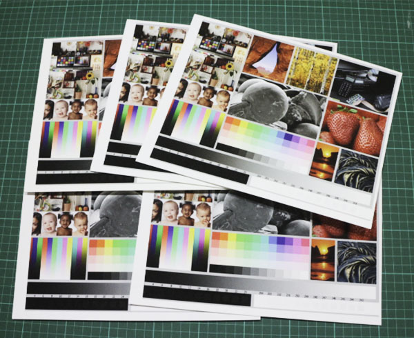
This is how I went about my test. I unpacked the pack of letter sized paper, two of each kind, onto my worktable. First I examined all the papers, grouping the smooth and the textured papers together in separate piles.
At first glance the papers in each group appeared very similar. It was only after careful examination that I noticed some were definitely whiter/brighter than others. OK, that must be the OBA or artificial brighteners at work, but that was the only discernable difference I could spot with the naked eye.
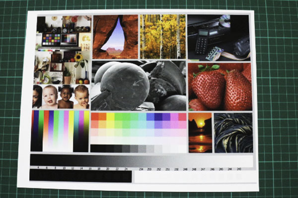
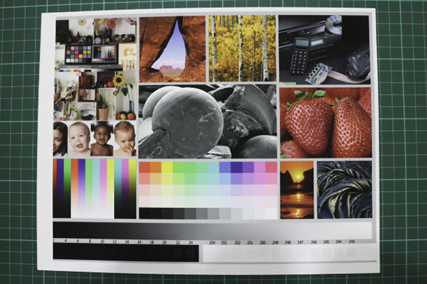
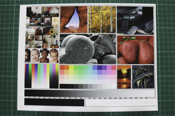
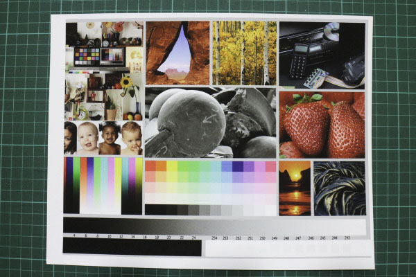
Now for the printing. As I had two sheets of each, I wanted to test both colour and B&W printing, so I started by preparing a test image for both. Each image was separately soft proofed using Image Print’s ICC profile (except for the 600MT which was missing from their library) and printed. When I was finished I again spent a long time examining each print and comparing the two groups of images, smooth and textured under the same lighting conditions. What I found was quite amazing.
Smooth Fine Art Papers:
Textured Fine Art Papers:
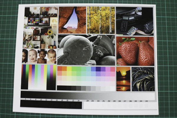
In conclusion. Besides the obvious difference in whiteness, I could find little difference between the prints. Each paper produced a good colour gamut, Dmax appearance and loads of detail. I often had to flip the prints over to check the identifying sticker on the back as I couldn’t really tell the difference. So, if you’re a purist, opt for the most expensive OBA free Pura papers at the sacrifice of some whiteness/brightness, but you’ll be saving the planet. If you reckon you’re prints are going to be around for hundreds of years, go for the archival quality of Optica One of Elegance Velvet or if you’re budget conscious, go for the 600MT. In each case your prints will look awesome on any wall. But most importantly, print your images because the only way to enjoy them is up on the wall.
PS. This test was done purely on a visual basis and did not involve the use of any optical calibration instruments. Besides, I have yet to see anyone walking around a photographic gallery with a whopping great spectrometer around their necks. They just use the ones they were born with.