 So, after agonising over your laden pallet for hours and carefully crafting the exact colours you envisioned, you’ve finally put the finishing touches to your next masterpiece. Then, remembering that Aunt Agatha had requested a copy of the piece, you whip out your iPhone 5s and snap a few shots. But when you pick up the prints from your local “Mega Store”, there’s a dull lifeless image staring back at you. The colours are nothing like what they should be. Sound familiar?
 When it comes to reproducing your artwork, whether it’s for record keeping purposes or print reproduction and sale, there’s a lot more to managing the colour workflow than you might think. Firstly, you will need to think about the quality of the light used to illuminate your artwork, then the colour settings on your camera, followed by the digital colour space and the format that your camera uses, to record the image file. When you finally download your images onto your computer, your monitor will play an important roll in the display of your images accurately and if you are going to print your images, it finally comes down to the quality of printer, ink and paper you choose. If this all sounds like a quagmire of potential disaster to you, maybe it’s time to take a closer look at your colour workflow.
As an artist, you are probably keenly aware of the colour of light. Fortunately modern digital cameras have a similar ability called “Auto White Balance” which alters the captured image to emulate daylight. Make use of this as a starting point, bearing in mind that the optimal light source for photographing artwork is, even illumination. This is best obtained from daylight balanced soft boxes in a controlled studio environment. But, if you only have a couple of desk lamps handy, fit daylight or “cool” light bulbs and try covering the shade with tracing paper to defuse the light. It’s important to note that the colour of the light will affect the colours of your printed artwork.
Keep in mind the old adage of GIGO, Garbage In Garbage Out, when you start taking pics. Set the tripod-mounted camera to record images at the highest setting available. If possible, the best is to record RAW or TIFF files that will allow you to make changes to settings like white balance and exposure later without loosing any quality. You can always compress the files into a smaller size later, but you can’t add information that isn’t there.
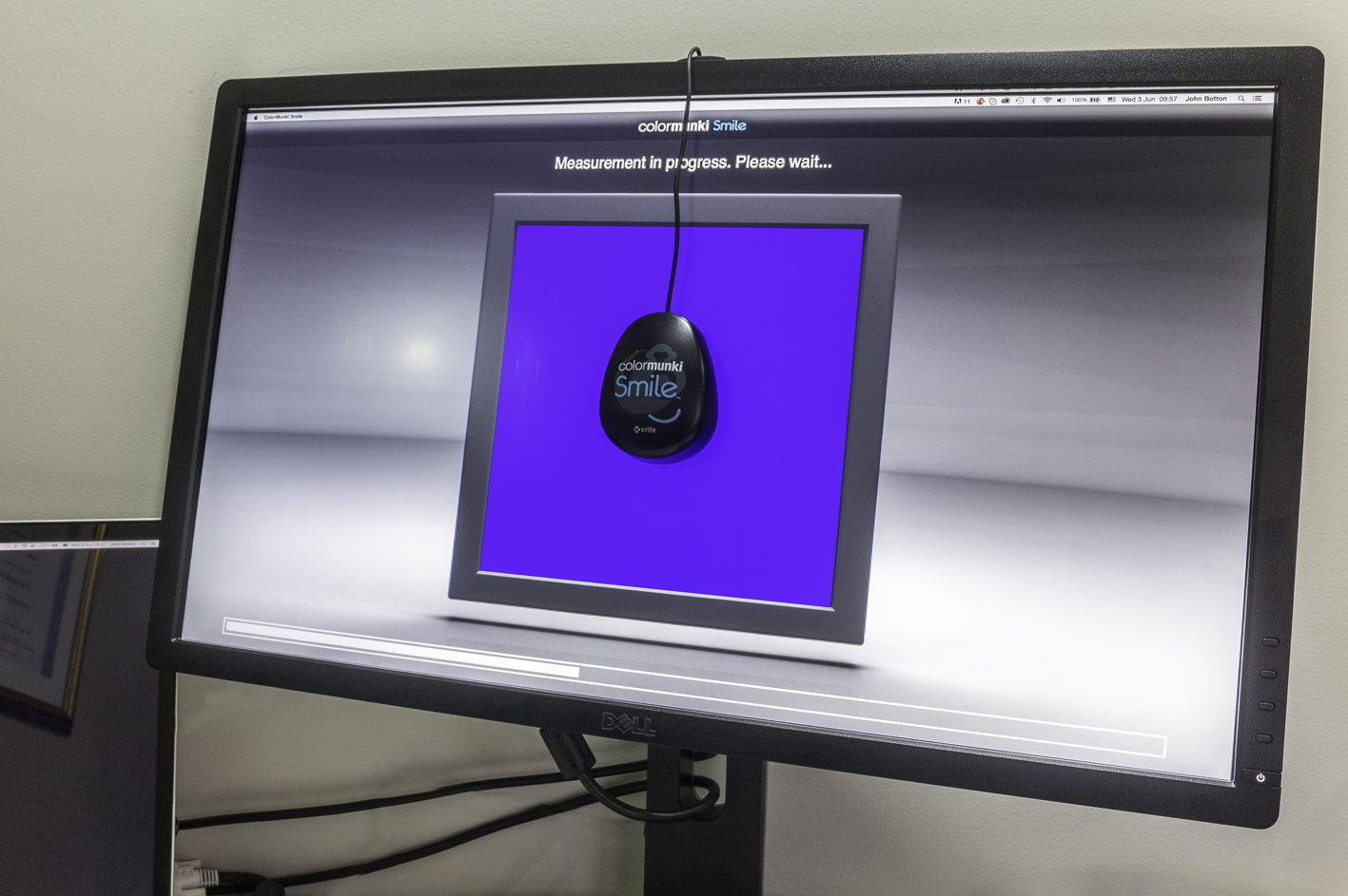
The next few stages of making a decent looking print for Aunt Agatha is going to get a bit technical, but she’s definitely worth all the fuss. When you start editing the images you’ve downloaded onto your computer, it’s essential to have a monitor that is correctly calibrated. You can do this yourself by eyeballing the display and manually adjusting the hue, saturation, brightness and contrast until what you think you see, is what you think your masterpiece looks like in real life. Or you can do it the easy way and use a display calibration gizmo like the Xrite ColorMunki, or any number of similar tools, just plug in and play.
 If you are using Lightroom, Photoshop or similar image editing software to make the final adjustments to your digitised masterpiece, you will have the advantage of any number of controls to get your image to look exactly as you want. But even if you only have the basic freeware like Google’s Picasa available, there are still a number of adjustments that can be made to get the best from your efforts. Try adjusting all the settings one at a time, moving from one extreme to the other, to get an idea of what the do. As long as your monitor is calibrated, what you see on the screen is what the print should look like. Right? Right!
 The final stage before laying down some ink is deciding what paper would best suit your work of art. Just as in the art world, there is a multitude of choice in printing substrates available (that is in itself a whole new discussion). For now, let’s assume that your magnum opus will be reproduced on a hot pressed fine art cotton based lignin free blue wool 5 archival paper, with no OBA’s. But before you reach over and press the print button, you will need to “soft proof” your image to ensure that the printer will indeed print what you see. In the bad old days, it was a process of trial and error, making a print, going back to the computer, making some adjustments and re-printing, resulting in a huge waste of time and materials in this tedious process. Fortunately, modern printmakers have tools such as soft proofing at their disposal. Soft proofing, usually done in Photoshop, entails the use of skilfully crafted ICC (International Color Consortium) printing profiles, a software filter that makes subtle changes in the printer’s instructions, to get the best results from the selected paper/printer combination. This ICC profile changes the display to simulate what the printer will actually print, allowing the print maker to make subtle changes to the image file. Each printer and paper combination will have a unique ICC profile, usually published by the paper manufacturer.
So, the moment has finally arrived. Hit the print button, grab your coffee, rush over to the printer and watch in anticipation, as Aunt Agatha’s early Christmas prezzie rolls off the press. The print head streaks across the paper, the image appears in linier instalments and with a final whirring of motors, emerges triumphantly into the light. A masterpiece. Now it’s off to the framers.
Or you can just go along to your local artwork reproducers.